
ノボジーン
  • ノボジーン
  • ゲノミクス
    • ヒト全ゲノムシーケンス
    • 動植物全ゲノムシーケンス
    • 微生物全ゲノムシーケンス
    • 動植物de novoシーケンス
    • 微生物de novoシーケンス
    • ショットガンメタゲノムシーケンス
    • アンプリコンシーケンス
    • 全エクソームシーケンス
    トランスクリプトミクス
    • mRNAシーケンス
    • トータルRNAシーケンス
    • 全長トランスクリプトームシーケンス
    • 全トランスクリプトームシーケンス
    • スモールRNAシーケンシング
    • 環状RNAシーケンス
    • メタトランスクリプトームシーケンス
    • 原核生物RNAシーケンス
    シングルセルと空間オミクス
    • シングルセル遺伝子発現解析
    • シングルセル免疫プロファイリングシーケンス
    • シングルセルロングリードトランスクリプトーム
    エピゲノミクス
    • 全ゲノムバイサルファイトシーケンス(WGBS)
    • ディレクトDNAメチレーションシーケンス(DM-Seq)new
    • 還元型バイサルファイトシーケンス (RRBS)
    • クロマチン免疫沈降シーケンス(ChIP-Seq)
    • RNA免疫沈降シーケンス (RIP-Seq)

    相乗りシーケンス

    • 相乗りシーケンス(イルミナプラットフォーム)
    • 相乗りシーケンス(PacBioプラットフォーム)
    プロテオミクス & メタボロミクス
    • Olinkプロテオミクス
  • プロモーションプロモーション
    • プラットフォーム
    • インテリジェント自動化プラットフォーム(Falcon)
    • バイオインフォマティクス解析ツール(NovoMagic)
    • カスタマサービスシステム(CSS)
    • パンフレット
    • ケーススタディ
    • ウェビナー
    • ブログ
    • サンプルガイドライン
    • コンミュニティ
    • がん研究
    • がん免疫
    • アグリゲノミクス
    • 環境
    • 食品科学
    • ヒトマイクロバイオーム
    • 植物および動物マイクロバイオーム
    • 創薬および開発
    • 希少および複雑性疾患
    • ノボジーンについて
    • 拠点一覧
    • ニュース
    • キャリア
  • お問い合わせお問い合わせ
  1. Home
  2. Resources
  3. ブログ
  4. GEO Data Mining (II) - Differential gene expression analysis and visualization with complete code sharing

GEO Data Mining (II) - Differential gene expression analysis and visualization with complete code sharing

In the previous two articles, “” and “,” we shared procedures and code for downloading sequence data. Now that we have the data, we can begin mining it. This article covers how to extract the downloaded sequence data, perform differential gene expression (DGE) analyses, find up-regulated and down-regulated genes, and then visualize changes in gene expression.

Why is differential expression analysis of genes valuable? During tumor pathogenesis or the progress of other diseases, gene expression can change. Some genes that were originally silent may become highly expressed, while other genes that were originally expressed normally may have increased or decreased expression in experimental samples. Genes that have altered expression levels compared with normal samples may control or affect tumorigenesis. Therefore, to study tumorigenesis mechanisms, investigators need to set up case (experiment or treatment) and control (control) groups for DGE analysis, explore the differentially expressed genes that characterize the treatment group and the control group, and construct gene enrichment pathways to study the pathogenesis of tumors. Then investigators can focus on interpreting these enriched pathways and explore the relationship or internal mechanism between these pathways and the phenotype of the sample.

Through the following four steps, we present a complete set of shared code for differential gene expression analysis and visualization:

Step 1: Extract expression matrix, clinical information, and chip number

The original data we downloaded, including metadata, constitutes the “eSet”. We will use the method of subsetting the list to extract the first element in the eSet list: eSet[[1]]. We will also use the “exprs” function to convert it into a matrix, usually using head (100) to determine whether the data needs to be converted to log type.

#(1) Extract expression matrix exp—-

exp <- exprs(eSet[[1]]) exp[1:4,1:4] #exp = log2(exp+1) #Judge whether log2 is needed

#(2) Extract clinical information —- The clinical information of each sample can be obtained by using the pData() function. Usually, the source column (source) or feature column (characteristics”) of the data frame will describe which samples are control or treatment.

pd <- pData(eSet[[1]])

#(3) Extract chip platform number —- The data usually use different chip probes, which are subsequently converted into entrez ID or symbol ID according to the GEO Platform (GPL) number. The NCBI database’s official name for the gene is represented by the Entrez ID. The HGNC database’s official name for the gene is represented by the symbol ID.

gpl <- eSet[[1]]@annotation p = identical(rownames(pd),colnames(exp)) save(gse,exp,pd,gpl,file = “step1_output.Rdata”)#Save the result

Step 2: Build grouping, chip annotation

1. Build group information The Rdata from Step 1 are grouped according to the sample source information in the GEO Series (GSE).

rm(list = ls()) load(“step1_output. Rdata”) library(stringr) table(colnames(exp)) group_list = ifelse(str_detect(pd$source_name_ch1,”tumor”),”test”,”normal”) group_list=factor(group_list, levels = c(“test”,”normal”)) group_list table(group_list)

2. Chip annotation of GLP

if(T){ a = getGEO(gpl,destdir = “.”) b = a@dataTable@table colnames(b) ids2 = b[,c(“ID”,”GENE_SYMBOL”)] colnames(ids2) = c(“probe_id”,”symbol”) ids2 = ids2[ids2$symbol!=”” & !str_detect(ids2$symbol,”///”),] } save(group_list,ids2,exp,pd,file = “step2_output.Rdata”)

Step 3: Data inspection – Principal Component Analysis

Next, perform principal component analysis (PCA) with the FactoMineR, factoextra package to determine whether there is a significant grouping between treatment and control groups. Use the code below to draw a PCA plot.

#Import the Rdata results of the first two steps

rm(list = ls())#clear the environment load(“step1_output. Rdata”) load(“step2_output. Rdata”) dat=as.data.frame(t(exp)) library(FactoMineR) library(factoextra) # Unified operation of pca dat.pca <- PCA(dat, graph = FALSE) pca_plot <- fviz_pca_ind(dat.pca, geom.ind = “point”, # show points only (nbut not “text”) col.ind = group_list, # color by groups palette = c(“#00AFBB”, “#E7B800”), addEllipses = TRUE, # Concentration ellipses legend.title = “Groups” ) print(pca_plot) ggsave(plot = pca_plot, filename = paste0(gse,”PCA.png”)) save(pca_plot, file = “pca_plot. Rdata”)
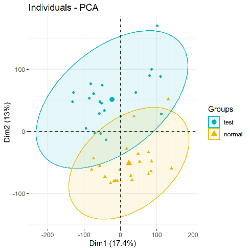
PCA plots(significant difference between subgroups of data)

Step 4: Differential gene expression analysis and visualization – volcano map and heat map

Next, import the Rdata from Steps 1 and 2, and use the limma package to perform differential gene expression (DGE) analysis on each gene. DGE analysis includes determining log fold change (logFC) of a gene, average expression level, and whether the p value is significant. DGE analysis uses two main input files: (1) the organized expression matrix, in which the row name is the gene name and the column name is the sample name; and (2) grouping information (group list).

DGE analysis with the limma package is divided into three steps: lmFit, eBayes, and topTable. Using the limma package requires three types of data: (1) Expression matrix exp grouping matrix; (2) Design difference comparison matrix; and (3) Contrast.matrix to get the differential analysis matrix (nrDEG). The analysis results focus on logFC and p value.

rm(list = ls()) load(“step1_output. Rdata”) load(“step2_output. Rdata”)

1. Differential gene expression analysis

library(limma) design=model.matrix(~group_list) fit=lmFit(exp, design) fit=eBayes(fit) deg=topTable(fit, coef=2, number = Inf) head(deg)

2. Add a few columns to the deg data frame

#1. Add the probe_id column and turn the row name into a column library(dplyr) deg <- mutate(deg,probe_id=rownames(deg)) #tibble::rownames_to_column() head(deg) #merge merges two tables table(deg$probe_id %in% ids$probe_id) #deg ​​<- inner_join(deg,ids,by=”probe_id”) deg <- merge(x = deg,y = ids2, by=”probe_id”) deg <- deg[!duplicated(deg$symbol),] dim(deg) #2. Add change column: up or down, the volcano map should be used #logFC_t=mean(deg$logFC)+2*sd(deg$logFC) logFC_t=1.5 change=ifelse(deg$P.Value>0.05,’stable’, ifelse( deg$logFC >logFC_t,’up’, ifelse( deg$logFC < -logFC_t,’down’,’stable’) ) ) deg <- mutate(deg, change) head(deg) table(deg$change)

3. Add the ENTREZID column, which will be used later in the enrichment analysis

library(ggplot2) library(clusterProfiler) library(org.Hs.eg.db) s2e <- bitr(unique(deg$symbol), fromType = “SYMBOL”, toType = c( “ENTREZID”), OrgDb = org.Hs.eg.db) head(s2e) head(deg) deg <- inner_join(deg,s2e,by=c(“symbol”=”SYMBOL”)) head(deg) save(logFC_t,deg,file = “step4_output.Rdata”)

Data visualization- volcano map, heat map

Several different types of graphs are available to visualize differential gene expression data, including volcano maps and heat maps.

rm(list = ls()) load(“step1_output. Rdata”) load(“step2_output. Rdata”) load(“step4_output. Rdata”) library(dplyr)

1.Volcano map

dat <- mutate(deg,v=-log10(P.Value)) if(T){ for_label <- dat%>% filter(symbol %in% c(“RUNX2″,”FN1”)) } if(F){ for_label <- dat %>% head(10) } if(F) { x1 = dat %>% filter(change == “up”) %>% head(3) x2 = dat %>% filter(change == “down”) %>% head(3) for_label = rbind(x1,x2) } p <- ggplot(data = dat, aes(x = logFC, y = v)) + geom_point(alpha=0.4, size=3.5, aes(color=change)) + ylab(“-log10(Pvalue)”)+ scale_color_manual(values=c(“blue”, “grey”,”red”))+ geom_vline(xintercept=c(-logFC_t,logFC_t),lty=4,col=”black”,lwd=0.8) + geom_hline(yintercept = -log10(0.05), lty=4, col=”black”, lwd=0.8) + theme_bw() p volcano_plot <- p + geom_point(size = 3, shape = 1, data = for_label) + ggrepel::geom_label_repel( aes(label = symbol), data = for_label, color=”black” ) volcano_plot ggsave(plot = volcano_plot, filename = paste0(gse,”volcano.png”))
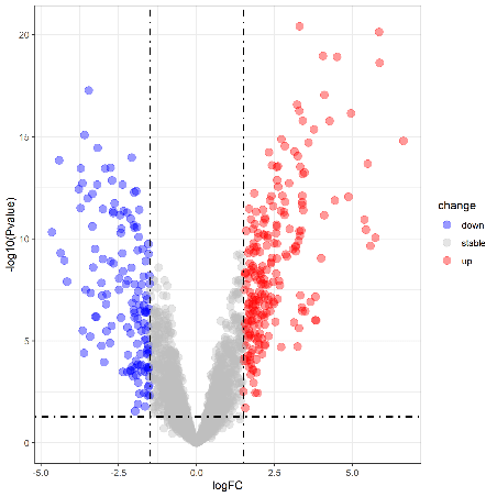
Volcano plot(Upregulation & Downregulation in Gene Expression)

2. Draw a heatmap

cg=names(tail(sort(apply(exp,1,sd)),1000)) n=exp[cg,] annotation_col=data.frame(group=group_list) rownames(annotation_col) = colnames(n) library(pheatmap) heatmap_plot <- pheatmap(n, show_colnames=F, show_rownames = F, annotation_col = annotation_col, scale = “row”) # save the result library(ggplot2) png(file = paste0(gse,”heatmap.png”)) ggsave(plot = heatmap_plot, filename = paste0(gse,”heatmap.png”)) dev.off()
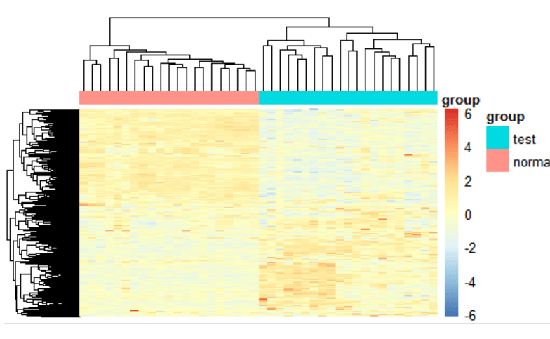
Heatmap(Measuring similarity of expression between subgroups)

At present, we have completed the differential gene expression analysis and visualization part of GEO data mining and have obtained significantly up-regulated and down-regulated differentially expressed genes. However, disease occurrence is often affected by more than one gene. For more tools to assist in studying disease and cancer mechanisms, stay tuned for our next tutorial on GEO data mining and identifying gene expression pathways.

サービスサービス menu

サポートサポート menu

会社会社 menu

サービス
全ゲノムシーケンスde novoシーケンスアンプリコンシーケンスショットガンメタゲノムシーケンスディレクトDNAメチレーションシーケンス(DM-Seq)mRNAシーケンスシングルセル遺伝子発現解析Olinkプロテオミクス
サポート
バイオインフォマティクス解析ツール(NovoMagic)カスタマサービスシステム(CSS)インテリジェント自動化プラットフォーム(Falcon)
会社
ノボジーンについて拠点一覧プラットフォームニュースキャリアお問い合わせ
YouTubeYouTube hoverXX hover
Copyright © 2026 Novogene Inc. All rights reserved. 本サービスは研究目的のみにご利用ください。臨床診断目的には使用頂けません。
ノボジーン
  • ノボジーン
  • ゲノミクス
    • ヒト全ゲノムシーケンス
    • 動植物全ゲノムシーケンス
    • 微生物全ゲノムシーケンス
    • 動植物de novoシーケンス
    • 微生物de novoシーケンス
    • ショットガンメタゲノムシーケンス
    • アンプリコンシーケンス
    • 全エクソームシーケンス
    トランスクリプトミクス
    • mRNAシーケンス
    • トータルRNAシーケンス
    • 全長トランスクリプトームシーケンス
    • 全トランスクリプトームシーケンス
    • スモールRNAシーケンシング
    • 環状RNAシーケンス
    • メタトランスクリプトームシーケンス
    • 原核生物RNAシーケンス
    シングルセルと空間オミクス
    • シングルセル遺伝子発現解析
    • シングルセル免疫プロファイリングシーケンス
    • シングルセルロングリードトランスクリプトーム
    エピゲノミクス
    • 全ゲノムバイサルファイトシーケンス(WGBS)
    • ディレクトDNAメチレーションシーケンス(DM-Seq)new
    • 還元型バイサルファイトシーケンス (RRBS)
    • クロマチン免疫沈降シーケンス(ChIP-Seq)
    • RNA免疫沈降シーケンス (RIP-Seq)

    相乗りシーケンス

    • 相乗りシーケンス(イルミナプラットフォーム)
    • 相乗りシーケンス(PacBioプラットフォーム)
    プロテオミクス & メタボロミクス
    • Olinkプロテオミクス
  • プロモーションプロモーション
    • プラットフォーム
    • インテリジェント自動化プラットフォーム(Falcon)
    • バイオインフォマティクス解析ツール(NovoMagic)
    • カスタマサービスシステム(CSS)
    • パンフレット
    • ケーススタディ
    • ウェビナー
    • ブログ
    • サンプルガイドライン
    • コンミュニティ
    • がん研究
    • がん免疫
    • アグリゲノミクス
    • 環境
    • 食品科学
    • ヒトマイクロバイオーム
    • 植物および動物マイクロバイオーム
    • 創薬および開発
    • 希少および複雑性疾患
    • ノボジーンについて
    • 拠点一覧
    • ニュース
    • キャリア
  • お問い合わせお問い合わせ
  1. Home
  2. Resources
  3. ブログ
  4. GEO Data Mining (II) - Differential gene expression analysis and visualization with complete code sharing

GEO Data Mining (II) - Differential gene expression analysis and visualization with complete code sharing

In the previous two articles, “” and “,” we shared procedures and code for downloading sequence data. Now that we have the data, we can begin mining it. This article covers how to extract the downloaded sequence data, perform differential gene expression (DGE) analyses, find up-regulated and down-regulated genes, and then visualize changes in gene expression.

Why is differential expression analysis of genes valuable? During tumor pathogenesis or the progress of other diseases, gene expression can change. Some genes that were originally silent may become highly expressed, while other genes that were originally expressed normally may have increased or decreased expression in experimental samples. Genes that have altered expression levels compared with normal samples may control or affect tumorigenesis. Therefore, to study tumorigenesis mechanisms, investigators need to set up case (experiment or treatment) and control (control) groups for DGE analysis, explore the differentially expressed genes that characterize the treatment group and the control group, and construct gene enrichment pathways to study the pathogenesis of tumors. Then investigators can focus on interpreting these enriched pathways and explore the relationship or internal mechanism between these pathways and the phenotype of the sample.

Through the following four steps, we present a complete set of shared code for differential gene expression analysis and visualization:

Step 1: Extract expression matrix, clinical information, and chip number

The original data we downloaded, including metadata, constitutes the “eSet”. We will use the method of subsetting the list to extract the first element in the eSet list: eSet[[1]]. We will also use the “exprs” function to convert it into a matrix, usually using head (100) to determine whether the data needs to be converted to log type.

#(1) Extract expression matrix exp—-

exp <- exprs(eSet[[1]]) exp[1:4,1:4] #exp = log2(exp+1) #Judge whether log2 is needed

#(2) Extract clinical information —- The clinical information of each sample can be obtained by using the pData() function. Usually, the source column (source) or feature column (characteristics”) of the data frame will describe which samples are control or treatment.

pd <- pData(eSet[[1]])

#(3) Extract chip platform number —- The data usually use different chip probes, which are subsequently converted into entrez ID or symbol ID according to the GEO Platform (GPL) number. The NCBI database’s official name for the gene is represented by the Entrez ID. The HGNC database’s official name for the gene is represented by the symbol ID.

gpl <- eSet[[1]]@annotation p = identical(rownames(pd),colnames(exp)) save(gse,exp,pd,gpl,file = “step1_output.Rdata”)#Save the result

Step 2: Build grouping, chip annotation

1. Build group information The Rdata from Step 1 are grouped according to the sample source information in the GEO Series (GSE).

rm(list = ls()) load(“step1_output. Rdata”) library(stringr) table(colnames(exp)) group_list = ifelse(str_detect(pd$source_name_ch1,”tumor”),”test”,”normal”) group_list=factor(group_list, levels = c(“test”,”normal”)) group_list table(group_list)

2. Chip annotation of GLP

if(T){ a = getGEO(gpl,destdir = “.”) b = a@dataTable@table colnames(b) ids2 = b[,c(“ID”,”GENE_SYMBOL”)] colnames(ids2) = c(“probe_id”,”symbol”) ids2 = ids2[ids2$symbol!=”” & !str_detect(ids2$symbol,”///”),] } save(group_list,ids2,exp,pd,file = “step2_output.Rdata”)

Step 3: Data inspection – Principal Component Analysis

Next, perform principal component analysis (PCA) with the FactoMineR, factoextra package to determine whether there is a significant grouping between treatment and control groups. Use the code below to draw a PCA plot.

#Import the Rdata results of the first two steps

rm(list = ls())#clear the environment load(“step1_output. Rdata”) load(“step2_output. Rdata”) dat=as.data.frame(t(exp)) library(FactoMineR) library(factoextra) # Unified operation of pca dat.pca <- PCA(dat, graph = FALSE) pca_plot <- fviz_pca_ind(dat.pca, geom.ind = “point”, # show points only (nbut not “text”) col.ind = group_list, # color by groups palette = c(“#00AFBB”, “#E7B800”), addEllipses = TRUE, # Concentration ellipses legend.title = “Groups” ) print(pca_plot) ggsave(plot = pca_plot, filename = paste0(gse,”PCA.png”)) save(pca_plot, file = “pca_plot. Rdata”)

PCA plots(significant difference between subgroups of data)

Step 4: Differential gene expression analysis and visualization – volcano map and heat map

Next, import the Rdata from Steps 1 and 2, and use the limma package to perform differential gene expression (DGE) analysis on each gene. DGE analysis includes determining log fold change (logFC) of a gene, average expression level, and whether the p value is significant. DGE analysis uses two main input files: (1) the organized expression matrix, in which the row name is the gene name and the column name is the sample name; and (2) grouping information (group list).

DGE analysis with the limma package is divided into three steps: lmFit, eBayes, and topTable. Using the limma package requires three types of data: (1) Expression matrix exp grouping matrix; (2) Design difference comparison matrix; and (3) Contrast.matrix to get the differential analysis matrix (nrDEG). The analysis results focus on logFC and p value.

rm(list = ls()) load(“step1_output. Rdata”) load(“step2_output. Rdata”)

1. Differential gene expression analysis

library(limma) design=model.matrix(~group_list) fit=lmFit(exp, design) fit=eBayes(fit) deg=topTable(fit, coef=2, number = Inf) head(deg)

2. Add a few columns to the deg data frame

#1. Add the probe_id column and turn the row name into a column library(dplyr) deg <- mutate(deg,probe_id=rownames(deg)) #tibble::rownames_to_column() head(deg) #merge merges two tables table(deg$probe_id %in% ids$probe_id) #deg ​​<- inner_join(deg,ids,by=”probe_id”) deg <- merge(x = deg,y = ids2, by=”probe_id”) deg <- deg[!duplicated(deg$symbol),] dim(deg) #2. Add change column: up or down, the volcano map should be used #logFC_t=mean(deg$logFC)+2*sd(deg$logFC) logFC_t=1.5 change=ifelse(deg$P.Value>0.05,’stable’, ifelse( deg$logFC >logFC_t,’up’, ifelse( deg$logFC < -logFC_t,’down’,’stable’) ) ) deg <- mutate(deg, change) head(deg) table(deg$change)

3. Add the ENTREZID column, which will be used later in the enrichment analysis

library(ggplot2) library(clusterProfiler) library(org.Hs.eg.db) s2e <- bitr(unique(deg$symbol), fromType = “SYMBOL”, toType = c( “ENTREZID”), OrgDb = org.Hs.eg.db) head(s2e) head(deg) deg <- inner_join(deg,s2e,by=c(“symbol”=”SYMBOL”)) head(deg) save(logFC_t,deg,file = “step4_output.Rdata”)

Data visualization- volcano map, heat map

Several different types of graphs are available to visualize differential gene expression data, including volcano maps and heat maps.

rm(list = ls()) load(“step1_output. Rdata”) load(“step2_output. Rdata”) load(“step4_output. Rdata”) library(dplyr)

1.Volcano map

dat <- mutate(deg,v=-log10(P.Value)) if(T){ for_label <- dat%>% filter(symbol %in% c(“RUNX2″,”FN1”)) } if(F){ for_label <- dat %>% head(10) } if(F) { x1 = dat %>% filter(change == “up”) %>% head(3) x2 = dat %>% filter(change == “down”) %>% head(3) for_label = rbind(x1,x2) } p <- ggplot(data = dat, aes(x = logFC, y = v)) + geom_point(alpha=0.4, size=3.5, aes(color=change)) + ylab(“-log10(Pvalue)”)+ scale_color_manual(values=c(“blue”, “grey”,”red”))+ geom_vline(xintercept=c(-logFC_t,logFC_t),lty=4,col=”black”,lwd=0.8) + geom_hline(yintercept = -log10(0.05), lty=4, col=”black”, lwd=0.8) + theme_bw() p volcano_plot <- p + geom_point(size = 3, shape = 1, data = for_label) + ggrepel::geom_label_repel( aes(label = symbol), data = for_label, color=”black” ) volcano_plot ggsave(plot = volcano_plot, filename = paste0(gse,”volcano.png”))

Volcano plot(Upregulation & Downregulation in Gene Expression)

2. Draw a heatmap

cg=names(tail(sort(apply(exp,1,sd)),1000)) n=exp[cg,] annotation_col=data.frame(group=group_list) rownames(annotation_col) = colnames(n) library(pheatmap) heatmap_plot <- pheatmap(n, show_colnames=F, show_rownames = F, annotation_col = annotation_col, scale = “row”) # save the result library(ggplot2) png(file = paste0(gse,”heatmap.png”)) ggsave(plot = heatmap_plot, filename = paste0(gse,”heatmap.png”)) dev.off()

Heatmap(Measuring similarity of expression between subgroups)

At present, we have completed the differential gene expression analysis and visualization part of GEO data mining and have obtained significantly up-regulated and down-regulated differentially expressed genes. However, disease occurrence is often affected by more than one gene. For more tools to assist in studying disease and cancer mechanisms, stay tuned for our next tutorial on GEO data mining and identifying gene expression pathways.

サービスサービス menu

サポートサポート menu

会社会社 menu

サービス
全ゲノムシーケンスde novoシーケンスアンプリコンシーケンスショットガンメタゲノムシーケンスディレクトDNAメチレーションシーケンス(DM-Seq)mRNAシーケンスシングルセル遺伝子発現解析Olinkプロテオミクス
サポート
バイオインフォマティクス解析ツール(NovoMagic)カスタマサービスシステム(CSS)インテリジェント自動化プラットフォーム(Falcon)
会社
ノボジーンについて拠点一覧プラットフォームニュースキャリアお問い合わせ
YouTubeYouTube hoverXX hover
Copyright © 2026 Novogene Inc. All rights reserved. 本サービスは研究目的のみにご利用ください。臨床診断目的には使用頂けません。
プライバシーポリシーCookieポリシーキャリア